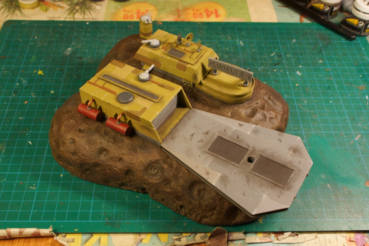
Painting the Hutt asteroid base was slightly different than normal. I knew that I wanted some other colours involved than the fairly standard grey. Also, no matter how much Star Wars tries to ignore the laws of physics, this base is outside of a gravity well and in a total vaccum as well. This meant I couldn't apply some more conventional effects like water/oil/rust streaks to simulate age and wear.
First I had to paint the 'rock'. I began by airbrushing it with VMC Chocolate Brown and when I was almost finished I added some VGC Black to the mixing pot and carefully airbrushed almost every crater with the mix. When this had dried I took out my biggest brush and drybrushed the entire rock with VGC Earth followed by a lighter drybrush using VGC Khaki. To give the rock some added 'flavour' I stained parts of it with a multitude of washes, ranging from blue, green, purple and red. I did forget to take a photo of that process however.
I airbrushed the landing pad with VGC Cold Grey and the hangar, cantina, command bunker and turret tower all received a couple of coats of VMC Middlestone. Fun trivia, Middle stone is a colour often recommended to paint late war German WWII vehicles. It supposedly closely resembles the 'Dunkelgelb' (Dark yellow) that Germany was using at that period of the war.
Next I picked out the details. The hangar door, the foundation of both the hangar and command bunker and the sign on top of the cantina was painted with Cold Grey. Every powerline and pipe was painted with VGC Beasty Brown while the vents and turrets plates was painted with a 1:1 mix of Cold Grey and VMC German Grey. I used VGC Terracotta on the the fuel tanks and the turrets got a few coats of VGC Stonewall Grey.
To give the base a more mismatched appearance I painted a few panels with differing shades of the base colour. The landing pad got a few brighter panels using Stonewall Grey while I used two mixes on the yellow areas. The brighter yellow panels was a 1:1 mix of Middle stone and Khaki and on the darker areas I used a 1:1 mix of Middlestone and Chocolate Brown. After this I shaded every nook and cranny with a 1:1 mix of Army Painter Dark Tone ink and Strong Tone ink.
Highlighting was fairly straightforward as I didn't want to make it very complex. For the yellow areas I mostly added Khaki and VGC Dead White into the base colours while the grey areas was highlighted by using more Stonewall Grey and a bit of Dead White.
With the highlighting done I could finally start on the fun part, weathering. I reasoned that, being an asteroid base and therefore placed inside an asteroid belt, it would periodically be hit with smaller asteroids. To represent this I did more sponge chipping than I normally would have. I also tried something new and 'sponge chipped' the landing pad with some black wash. As I had suspected, this didn't come out as chips, but rather stains of oil and assorted fluids.
To give the chips some added depth I painted most of them with some thinned out German Grey. For the bigger ones I also added some Cold Grey followed by Stonewall Grey in the middle. This makes the chips slightly metallic looking and gives the impression of a deeper impact.
As I stated before, I couldn't do fluid streaks or rust due to the vaccum and lack of gravity. However I found no problem with dust! This would have been built up due to the building process, micro asteroids hitting the station and of course the engine wash from ships coming and going. To simulate this I took out my dry pigments and made a 3:1 of black pigments and a Mig powder called Rubble Dust. This mix was then liberally added to large areas of base, particularly around the vents and the landing pad.
The commissioner had a couple of requests that I had to fulfill before I could consider the model finished. First, he wanted a Scum & Villainy logo on top of the cantina. This was a fairly simple affair where I basically copied the design straight from a picture I found on the net. He also wanted the sign on top of the cantina to be a neon colour and while I certainly agreed with him, I wasn't quite sure how to accomplish it.
Luckily, I had just gotten myself a new airbrush and I also took the opportunity to buy some fluo colours. Armed with this I started by painting the sign with VGC Scarlett Red which I shaded with some red wash. The next step was airbrushing the sign with VMC Orange Fluo. This made sure that the letters had the proper colour and also simulated light coming off the sign. To finish off the sign I highlighted it with Orange Fluo mixed with some VMC Yellow Fluo. While I'm not quite happy with the end result, it is the first time I've tried something like this and with a brand new aibrush as well. Considering that, I suppose it is more than adequate enough.


No comments:
Post a Comment